Roblox Studio’s Start Screen Gets a Visual Upgrade + More Improvements!
by Matthew Dean
Product & Tech Creators
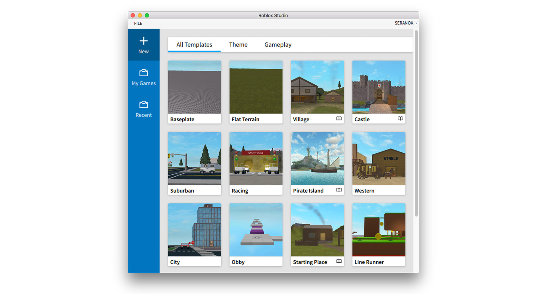
Roblox Studio is always evolving to meet the needs of our rapidly growing developer community. As we continue to welcome and empower creators from all over the world, we’re passionate about shipping features to make developing games on Roblox faster, easier, and more streamlined than ever before. Today, we’re thrilled to announce that we have completely revamped the Studio start screen to offer greater functionality and provide a better user experience for all creators. Let’s take a moment to dive in and see what’s new.
First and foremost, we’ve given the Studio start screen a fresh coat of paint to create a more unified design that’s consistent with the rest of the Roblox platform. You’ll notice right away that Studio has a much cleaner, more modern look. Like before, the sidebar allows you to quickly start new projects by selecting from a list of templates sorted by theme and gameplay, check out your games, or see your most recent Studio files.

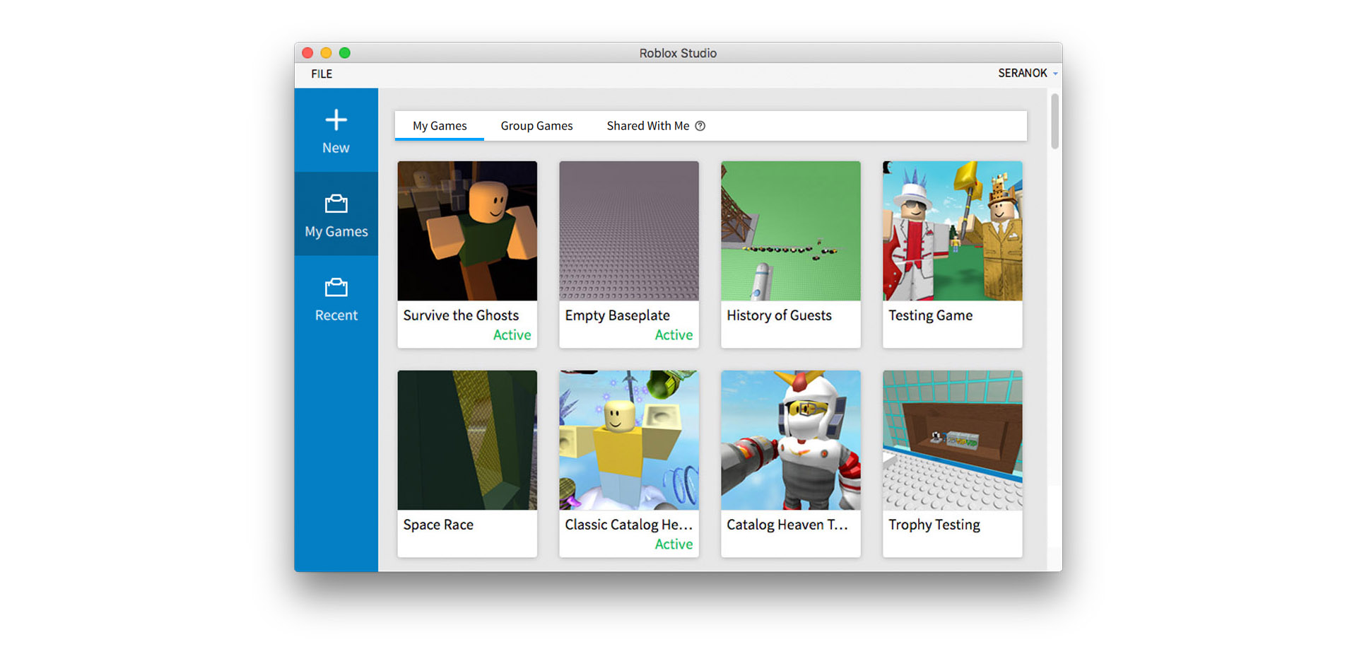
Along with the new look, you’ll now be able to see any Team Create games other users have invited you to right from the start screen as well. Simply go to “My Games” from the sidebar in Studio, then click the “Shared With Me” tab. This new feature allows you to easily find games that friends have invited you to edit. One other major improvement is that the “My Games” menu will also show you which projects are live and playable by others.

We’re always looking for new and exciting ways to continue refining the Studio experience. We value your feedback, so please let us know what you’d like to see in future iterations of Roblox Studio by posting your suggestions on the Developer Forum.
Until then, stay tuned for more exciting news on the Roblox Blog soon.