Blog Archive
New Profile Pages Add New Features for Interacting With Friends
by Sorcus
Archive News
You may have noticed something very different when you went to a friend’s profile page on ROBLOX.com. That’s right, we’ve completely redesigned the profile page, as part of our ongoing makeover to make ROBLOX easier to use, and nicer to look at.
Our new profile page is designed to look clean and be easy to navigate on any screen. Now there’s more content available without having to scroll, and the drop down windows cut down on the amount of clicking you need to do to browse through your friend’s badges, collections, and places.
You’ll notice that everything is presented much larger, with bigger images and text. Different categories, like places and groups are color coded to make it easier to find things at a glance, no matter where they are on the page (more on that in bit).
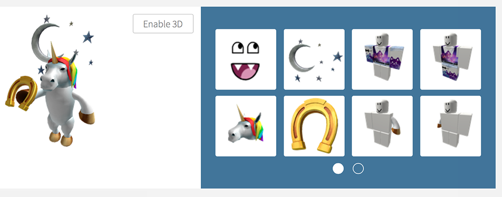
Additionally a new feature to the profile page allows you to see the individual items another player currently has on. Love someone hair or shirt? Now it’s easier to find it yourself!
Can I change my profile page?
In the future we’ll be adding customization options, so you can move tiles around and organize your profile to show off the things you care most about. We want your profile page to be a reflection of you, and recognize that a lot of ROBLOX users used it to show off art. We’ll be working on ways for you to be able to showcase your talents and interests to the community.
