Blog Archive

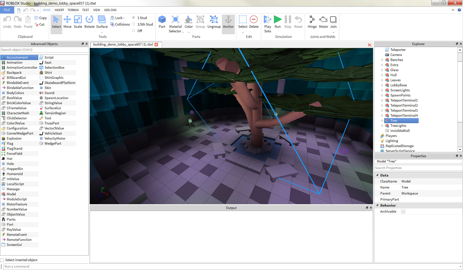
The new “Ribbon Bar” interface streamlines building and developing. Click the image to view at full size.
Today, we unveiled an upgraded user interface for our development environment, ROBLOX Studio. The new interface is known to us as the “Ribbon Bar” — something you see in other professional creative software — and makes building and developing more streamlined. Any builder or game developer will rightfully tell you that making a game on Studio can be complex — we feel that organizational tools like the Ribbon Bar will help you complete even large-scale projects faster.
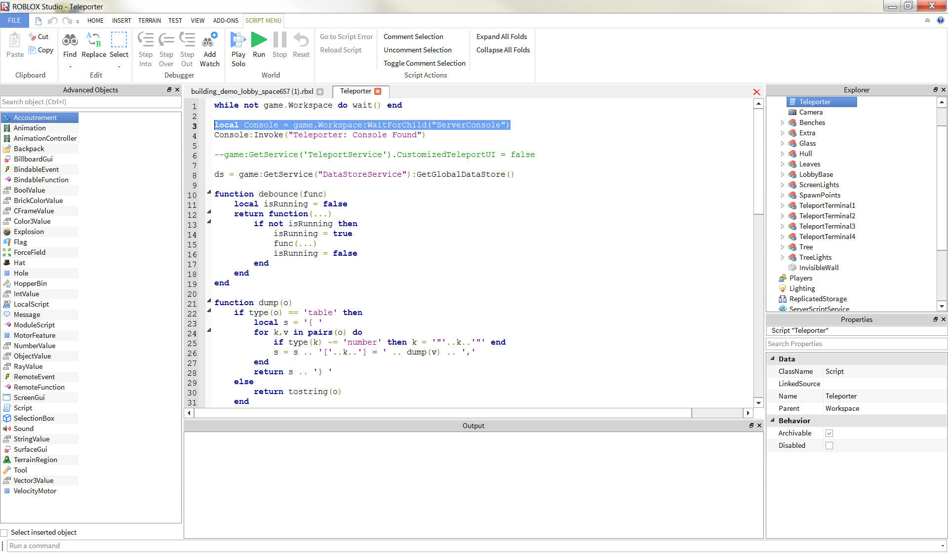
Immediately noticeable is the size the buttons. Though on the surface there appears to be far fewer buttons than before, each of the buttons functions as a “bin” or “folder” for several relevant tools (thanks for the awesome design work, totbl). This helps with organizing not just your parts, scripts, and executable actions, but also gives the Ribbon Bar a refined and modern look. We’ve also implemented tabs, which should consolidate the steps you take to complete processes in Studio. Are you building with terrain? Pop over to the Terrain tab and find all the terrain options in one place. Scripting? Drop a script into your Workspace and use the Scripting tab for all of your coding needs. Rather than having everything available at all times, we’ve added order to the chaos.
Aesthetics aside, there are also minor features baked into this update. The Test tab lets you configure how many players (between one and eight) can join your game without starting a bunch of new instances, which should help builders iterate their levels faster. Inserting objects and scripts can be done faster than ever — try heading to the Insert tab, where you can now drag your advanced object right into your Workspace. This is all designed around creating a steadier, more fluid Studio building experience.
Experiment with the Ribbon Bar. Once you get used to it, you’ll find building and developing to be much easier than it has been in the past. As always, we’ll be listening to your feedback.
If you’re 100% set in your ROBLOX Studio building ways, you can change your UI back to the traditional “System Menu” layout of the past. Click Tools > Settings > Studio > General > UI Style > System Menu. As you know, ROBLOX is ever-evolving — we’ll continue updating Studio to make it more robust, feature-rich, and most importantly, easy to use.
