Blog Archive
What’s New
ROBLOX’s updated font engine is more robust, both in Studio, and in game. Join any game that you love playing and take a look at the letters in the text of any GUI–they are sharper and easier to read. That’s because we’ve upped the number of natively rendered font sizes from two to six. Other sizes will still be scaled during rendering and appear blurry–keep reading for guidelines on maintaining crisp text.
Along with six native font sizes, our font engine now performs kerning, which is a process that adjusts spacing between characters. This makes long sections of text more readable as letters are properly spaced based on the width, length, and shape of each character.
We’ve added two new font faces: Source Sans and Source Sans Bold. These supplement the existing Legacy, Arial and Arial Bold. The Source Sans font faces may look familiar to you–that’s because Source Sans is the same font we use on our website. We think this will help establish a more unified aesthetic between ROBLOX.com and ROBLOX games.
Finally, we’ve transitioned to packaging all the characters and symbols you can use into a single “sprite sheet.” This keeps memory extremely low while giving users access to the maximum amount of characters and symbols.
![]()
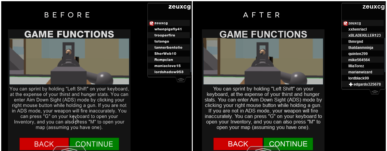
As a result of all these changes, the standard ROBLOX GUIs and many developer-created GUIs look crisper. This also gives you much more precise control over how your text appears in your GUIs moving forward. We thought now would be a good time to walk you through some general tips and pointers when creating text for your game.
Utilizing the New Font Engine–Tips and Pointers
Try Something Other than Legacy: Many builders use the Legacy font because it’s the default font in Studio. Unfortunately, the size of Legacy text is difficult to determine–the other four fonts have relatively equal sizing qualities (e.g. “16” for Source Sans is just about the same size as “16” for Arial). Legacy text is 150% larger than the other four fonts–it doesn’t follow the same sizing rules. In order to address this problem, we would have to shrink the parameters of Legacy text to fall in line with the other four fonts. We decided not to do this, as this would completely alter the look of all existing GUIs on ROBLOX that are using Legacy text. We encourage you to use our new Source Sans and Source Sans Bold to experiment with different looking text.
Use Bold: Legacy also doesn’t feature a “Bold” setting–while it may seem obvious, it’s worth pointing out that using bold can really help accentuate text in your game. If you have a lots of information to convey (say, a tutorial on how to play your game), use bold to highlight the main points for players who don’t want to read a wall of text.
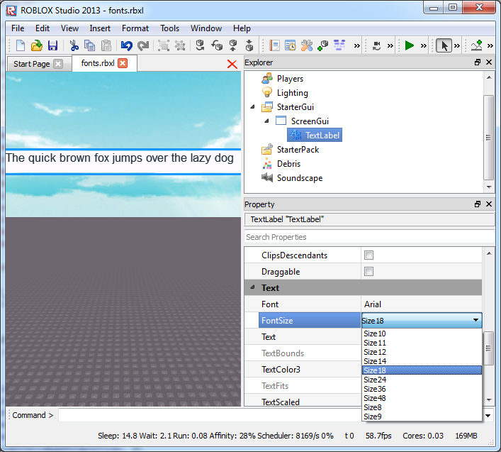 Use Native Sizes: As we mentioned above, there are now many more options to explore when choosing font sizes. The following font sizes will render razor sharp: 10, 12, 14, 18, 24, and 48. We’re working on sharpening more sizes–particularly in the medium range (e.g. 16 and 26).
We look forward to seeing how text in GUIs changes in the coming weeks and months, and will be sure to keep an eye out for interfaces with sharp and precise characters and symbols. Paying attention to these sorts of details goes a long way toward creating a professional look for your place or game.