Blog Archive
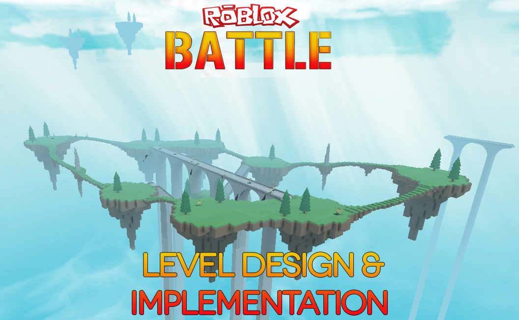 If you’ve been keeping up with the blog (or if you’ve played ROBLOX Battle lately), you’ll have undoubtedly noticed major changes being made to one of our flagship titles. We’ve been updating and enhancing ROBLOX Battle to become a much deeper and more intuitive game. In our first part of the Building ROBLOX Battle series, we talked about how ROBLOX developers spent a ton of time enhancing gameplay by adding new modes, weapons, and much more. Today, we got the chance to sit down and talk with stickmasterluke about designing the new maps in ROBLOX Battle and some of the challenges of creating beautiful and balanced levels.
When we decided, for sure, that we wanted to revamp ROBLOX Battle a few months back, Sorcus made the suggestion of having a cycle of levels instead of just letting Crossroads become the staple level of ROBLOX Battle (even though it still sort of is). I was tasked with creating and building these new levels, and knew this early on that it would be no small task. Starting entirely from scratch (and some detailed notes I took from Crossroads), I started building.
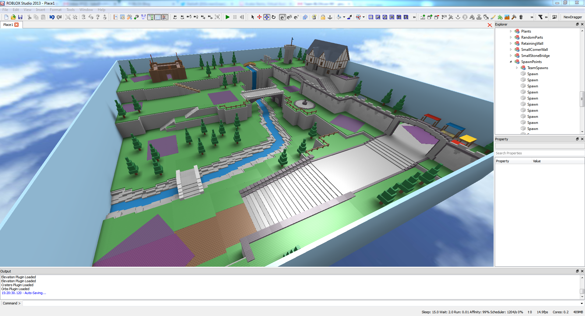
The first map I designed was Raven Rock–of all the recently added maps, this one was most inspired by Crossroads. You see, Crossroads never had a direct theme, per-se, but definitely had a definitive look. Medieval-style builds are a good place to start (their basic structures are easier to replicate than say, a city building)–so I decided that would be my theme for Raven Rock. I made this wide open valley with medieval-styled houses and buildings, then started adding arches throughout the map. I originally wanted to call the map Arch Valley, but not everyone went for that. I also wanted to focus on small details–the wooden fort, water going through the valley and the stone texture on the walls were last minute inclusions that I think helped the place come to life. I showed it to Sorcus and his response was immediate: “More.”
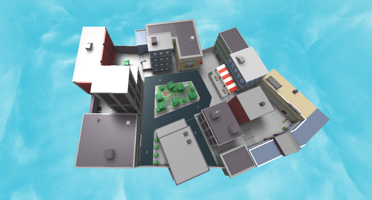
Keeping themes in mind, I decided I wanted my second map to be city-themed, which eventually manifested as Bloxburg. I knew this was going to be challenging because I don’t typically build cities. I immediately ran into problems that I never previously encountered–the layout itself, which I originally designed as a grid, was boring and would make for stale gameplay. I tried morphing the grid, but it just didn’t feel right. Eventually, I turned the grid into the shape of an “R”, and that actually worked. This taught me a lot–I’d never built in these weird, awkward angles and had to build with pieces I normally wouldn’t use. I started in the middle (which is a great tip, if you’re planning on designing multiplayer maps) and built outward.
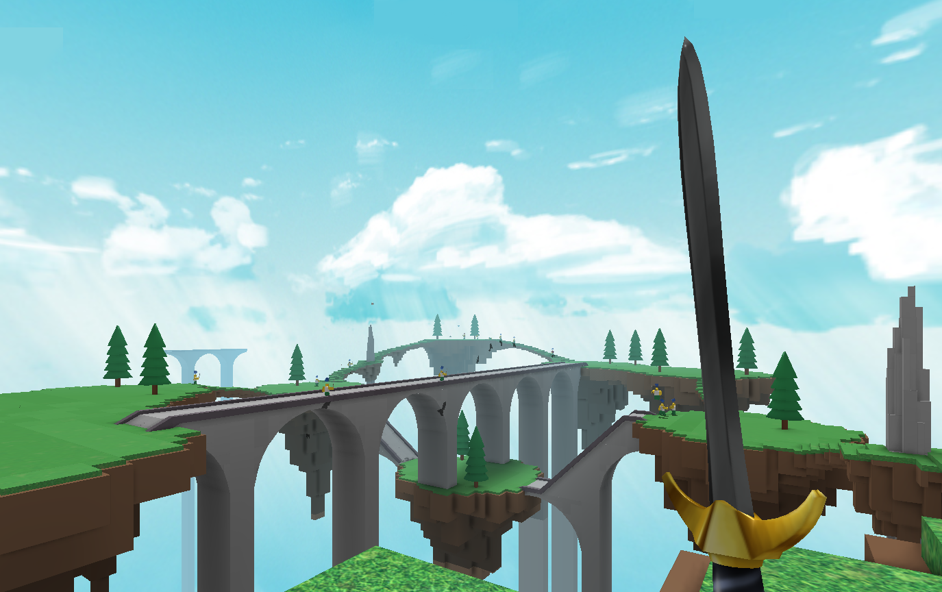
Around this time, I caught wind that other members of the Content Team were working on brand new game modes. I loved the idea of “Sword Swept” (we called it Swords vs. Brooms back then)–a mode where two competing teams with different weapons have to use the environment to their advantage. The team wanted a map that would work well within the rules of t his mode, and that’s when I started creating Skylands. Skylands is an interesting build for numerous reasons–the main one being that I wanted to make a level with lots of pits and places to fall off of the map. An environment in the sky seemed to fit those parameters. I also wanted a balance of open environment and closed spaces. So you’ve got these wide open islands in the sky, interconnected by narrow and dangerous bridges–watching people play Sword Swept is a great deal of fun, because players with swords try to stay grounded on the islands, while broom-weilders try to lure them out onto the narrow bridges and knock them off the map. We originally had planned to only use Skylands for the Sword Swept game mode, but we liked it so much we made it work with others, including Team Deathmatch.
I learned a ton about lighting when constructing these maps–I developed a system where I could define all lighting properties and parameters in any given map. Setting these parameters refines the building experience. It allows you to approach the map with rules set in stone–“this is how bright outdoor ambient lighting will be. This is how far you can see. The time of day stays locked at 2PM.” Etc.
ROBLOX Battle is constantly evolving, and our new lobby reflects this. I know that Dan touched on the gameplay ramifications of such a place in his initial article–essentially, the lobby gives you a break from all the Battle madness. It’s also a social environment where you can talk with other players, vote for maps, and choose teams. Dan also touched on this little known fact: the lobby can be seen from any map in the game. We thought it was kind of bizarre to have a floating lobby in the sky, so I recently decided to do something about it.
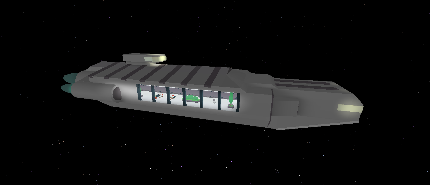
That’s right, the lobby is now a spaceship (which I figured was the best way to explain a floating fortress in the sky, right?).
Having been a builder, level creator and game designer for the majority of my life, I’ve developed some tips to share with users who are building maps.
Spawn Points: There should be no visual contact between team spawns. This sounds simple, but when you’ve got players getting knocked out at any possible time, and other players scattered throughout the map, it becomes a much more complex idea.
Symmetry: This isn’t to say that both sides of the map should be completely symmetrical–to the contrary, that makes for a boring multiplayer experience. Just have the same general amount of shortcomings and advantages on each side of the map (i.e. equal amounts of cover, equal dips in elevation, equal amounts of space and terrain.)
Encourage Exploration: Observe player behavior and watch what areas of your level attract players most. If a large part of your map is being collectively ignored, find a way to draw players there. Don’t be afraid to remove parts that aren’t effective. No matter the size, you want your map to be concise as possible.
Wide Open/Narrow Closed Areas: A good map has both, and in equal measure. A good place to start is to create a map with a wide open central point, then surround space with narrow passageways. This isn’t the only way to do this, but it’s a good place to start.
The Content Team is continually changing ROBLOX Battle to make it the most robust multiplayer experience on ROBLOX. Keep your eyes on the blog, where we’ll have more behind-the-scenes Building ROBLOX Battle stories soon.
