Blog Archive
About a week ago, we asked users to submit their best and most creative places via the ROBLOX Game Design forum. We told them that the top picks of the litter would receive critiques by our very own ROBLOX developers, and we’re here to do just that. We chose four of our favorite submissions, and shipped them off to our dev team for feedback. Here’s what they had to say:
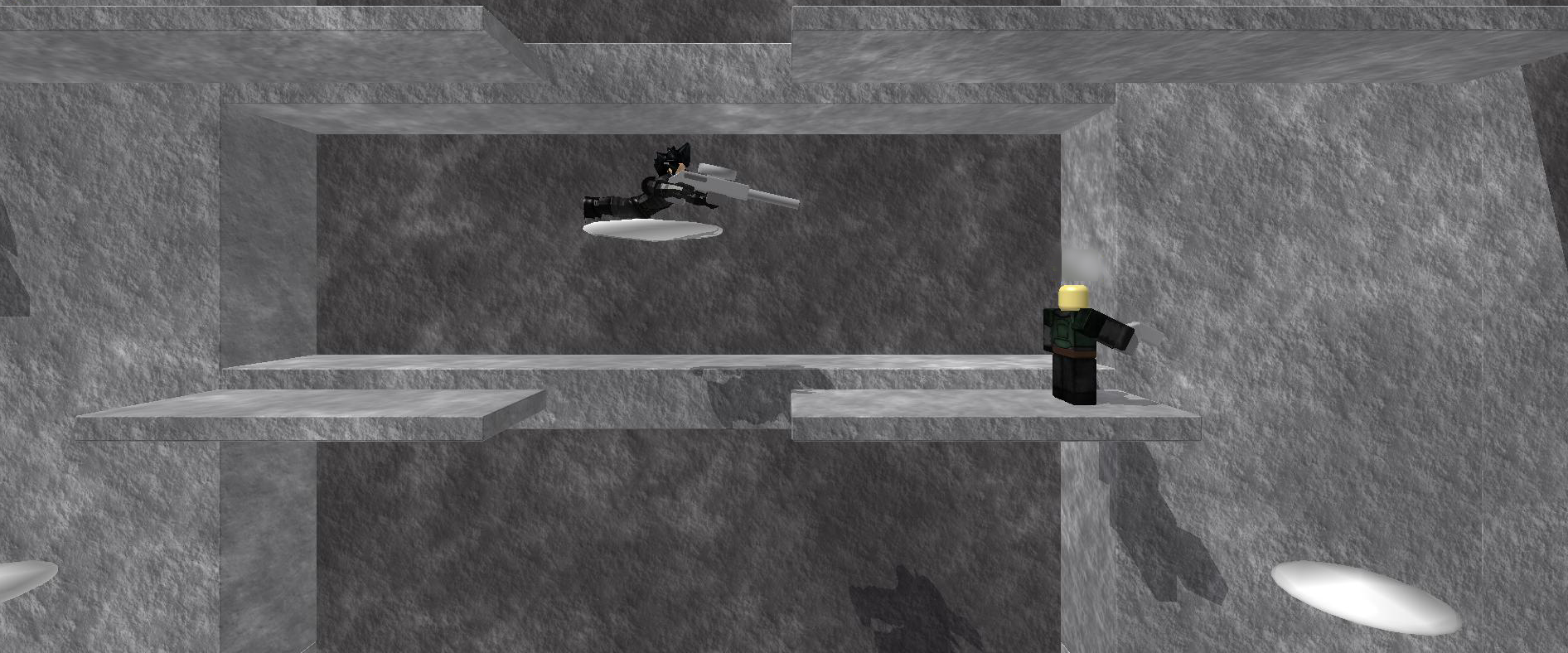
Luke Weber, ROBLOX Content Team, on Ice Castle, an open-world environment by Gerrett99
Ice Castle is definitely one of the coolest (heyo) places I have seen that’s been made in a Personal Build Server. I wouldn’t really judge it as a game–it’s not. It’s art, and it’s beautiful. I would add a bit more ice in places other than the suspension bridges. It could also be a good idea to fill the underside of the islands with more land to really give it the full floating island feel.
The architecture is what impressed me most. Tall structures and arches have a soft spot in my heart. This place stands as a good reminder that not all places on Roblox are games–some are a means of artistic expression.
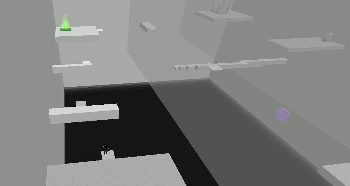
Dan Healy, ROBLOX Content Team, on Burning Gray, a RPG with platforming elements by Shadowlego7 and Ninja Sheep
It’s immediately evident when you enter Burning Gray that a lot of effort was put into it. Right away you’re presented with a custom loading screen and music that perfectly accompanies you through the intro and throughout the game. The music goes well with the challenges you face as you play, which in the first couple levels vary from obstacle courses to puzzles to boss fights.
The variety in the game is what made it so enjoyable — it made me fully interested in the challenge at hand instead of just hurrying through to get to the next “interesting” part. The story bits featured clever dialogue and kept me engaged. The obstacles were challenging but pretty well broken up, so it still felt like I was making good progress. The puzzles were fun but not very difficult at the beginning – I’ll have to continue playing to see how they evolve as the game goes on.
The moving platforms required constant input in order to stay on them. If this was desired in order to add more challenge, it wasn’t clear. There are ways to have the player automatically move with the platform–this usually requires crafty tweaking, but opens up many more possibilities for challenges because the player is free to look around and interact with the environment. (Click here for some examples of different ways.) Another improvement you could make is opening up the one-player-only zones. These block progress for other players. This could be a method of forcing the single player to describe what’s happening verbally, but it would be easier and more satisfying to allow other players to observe what’s happening through a window.
For this game, I think it would be more desirable to keep the one-player-only areas without blocking other players. This could be done by carefully making a copy of the area for each player that gets to it, then cleaning it up when they’re done so things don’t get laggy. One thing the creators probably anticipated but have not implemented yet is persistence — that is, saving player progress between sessions so you don’t have to beat the whole game in one sitting. Overall, I had a lot of fun playing this game and I highly recommend checking it out! I look forward to seeing how it changes as more chapters are added — awesome work so far guys!
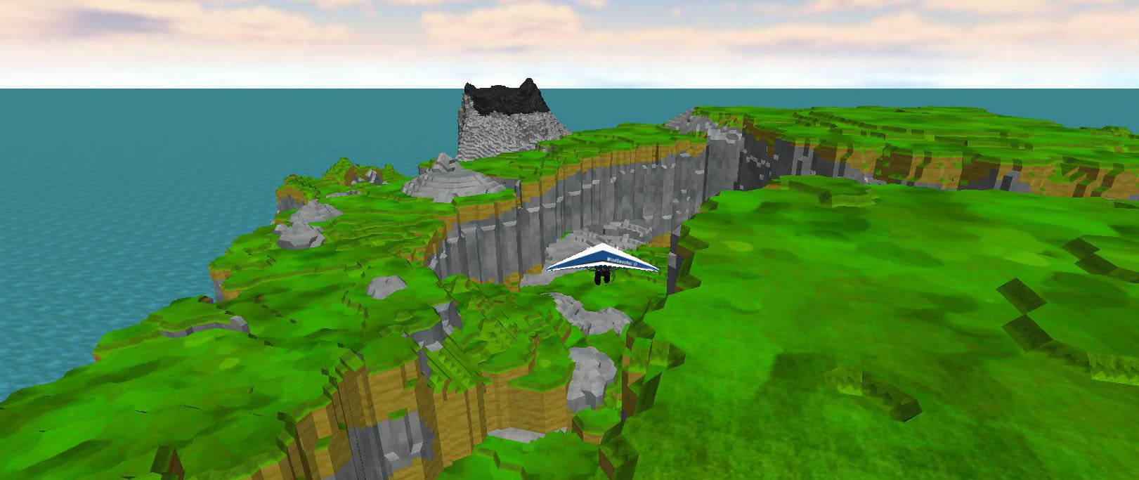
Kip Turner, ROBLOX Content Team, on Massive Terrain, an open-world hang-gliding place by Zathara
The use of ROBLOX terrain is great; I really enjoy the amazing vistas from the tops of volcanoes and peaks. While the vistas look amazing from a distance, you start to notice a lack of detail as you move closer to the terrain. Details like shrubbery and trees can add a significant level of immersion for on-foot and low-flying players. If you decide add those elements, I would recommend using a few parts that aesthetically match the level of detail in the terrain, rather than a high-resolution mesh. Doing so will also help save on the rendering time of all those polygons — when creating a massive level of this size the level designer needs to be very careful not to put too much on the screen or the game may run slowly.
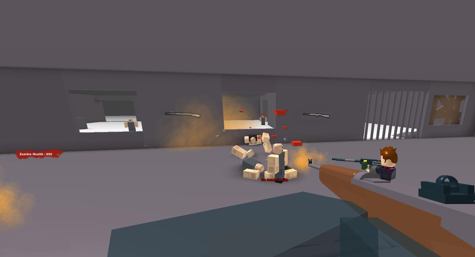
Zachary Linblad, ROBLOX Content Team, on Rampage, a side-scrolling shooter by SHABOBO99
Camera manipulation in ROBLOX can be extremely difficult, but the results can be equally rewarding. Rampage’s excellent use of a “platformer” style camera feels like the start of something really great. The subtle smooth leading of the camera to where you’re aiming perfectly emulates retail games like Capsized, and freeware classics like Codename Gordon. It’s the level of quality in those kinds of minute details that makes me excited to see what SHABOBO99 improves on next — because there are admittedly large gaps in Rampage right now.
The enemy AI could use some tweaking, there is only one vehicle that never regenerates, I have no way of knowing I have any weapons when I first join, and the fact there is zero PVP action is a puzzling omission. But what SHABOBO99 gets right, he gets right, and I know that quality will spread to the rest of this product he’s crafting. SHABOBO99: if everything eventually becomes as finely tuned as your camera and grappling hook, you’ll have one of the best games on ROBLOX.


