Blog Archive
A few months back, we showed off some prototype videos that detailed what the future look of ROBLOX might be. We discovered a lot of interesting facets of our platform and took many of those tidbits of knowledge with us moving forward. Previous designs have taught us a lot about what we think could make ROBLOX look great in the future (particularly our growing understanding of lighting and shadows). Our previous ideas for our future look featured extremely realistic parts that required some serious computational lifting, and we wanted ensure that mobile devices, like the iPad (or any other mobile device we develop for in the future), would be able to handle the load. These new visual prototypes reflect our efforts to drastically alter the appearance of ROBLOX in way that’s smooth and playable on any device.
After seven iterations between the ROBLOX staff and our Technical Artist, this is a look at what we believe is the best step in the right direction.
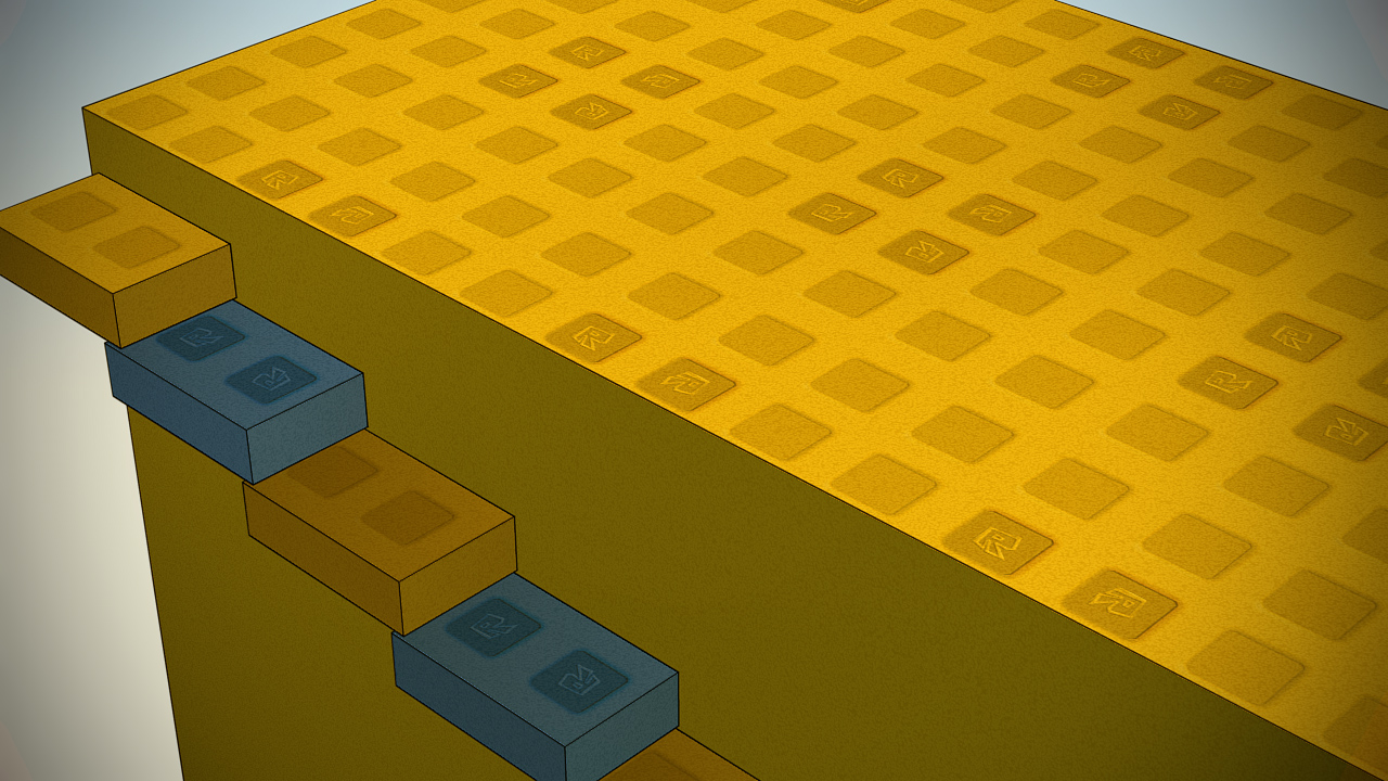
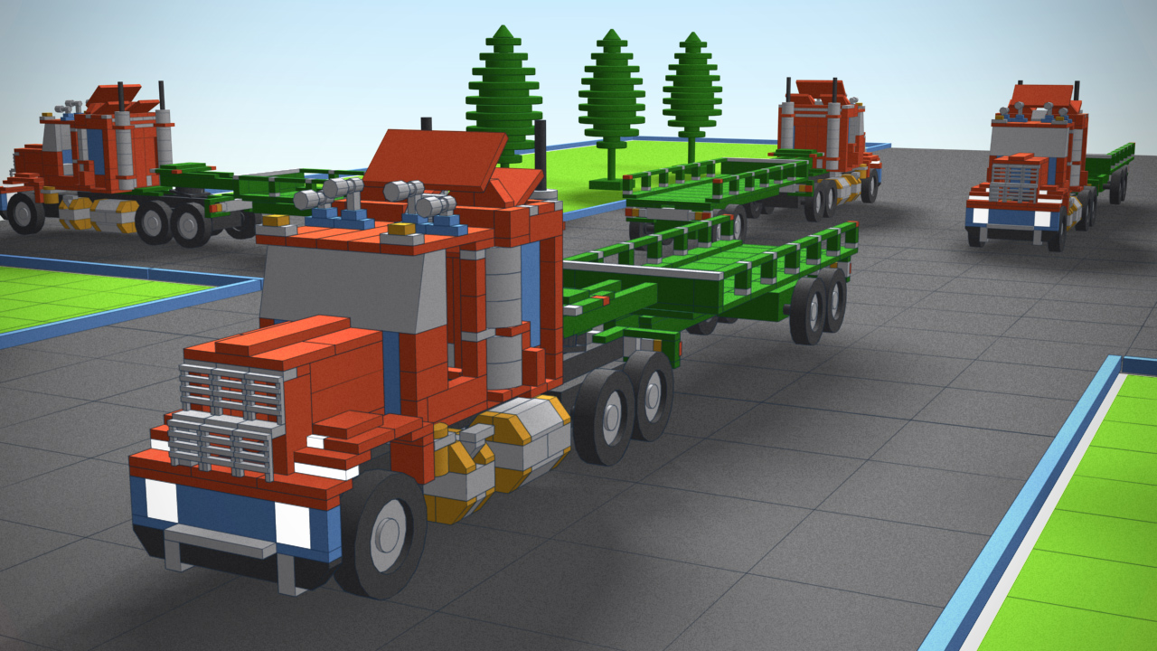
What you’ll immediately notice is that we’re using a different type of shading. Most of the parts in the video are plastic–we’ve added high frequency noise to each of the parts so they look slightly imperfect and tangible. The parts will also give subtle depth cues as to how far a piece is away from the viewer.
You’ll also notice heavy dark outlines, which we think really changes the look and feel of our parts and vehicles. The lines darken and become more apparent the closer any object gets to your line of site, which was done purposely. The lines seamlessly fade away as objects move away from you.

We're going for a "engineering" type of look--especially with the lines. The noise on plastic is part of our attempt to make plastic beautiful.
We’re taking a lot of the tech behind our previous gaze into the future, and mixing it together differently. We were very happy with our previous experimental lighting system using Voxel lighting technology, for example, and we’re applying the same principles here. Voxel lighting allows you to dynamically light an environment using multiple sources of ambient or artificial light–which means different objects in an environment are lit differently depending on their proximity to the nearest light source. This alters how shadows move in 3D space. You’ll notice the shadows are blurry and light, but also varied depending on the closest light source to them. We’re not 100% sure Voxel lighting will be our definitive lighting method, but it has certainly shown the most promise so far.
It’s important to note that these are renders–prototypes–and are not running in real time. We’re building these demo scenes in 3D StudioMax so we can get a sense of what this would look like before implementing them in C++, which takes much longer to generate results. As stated earlier, we’ve gone through several prototypes before arriving on an overall look that is heading in the right direction. Here is an earlier iteration:
This was an experiment in different types of high frequency noise. You’ll also notice that we experimented with the idea of making the outlines white instead of black. We actually had the outlines rendered in a bevy of different colors before arriving on black.
We’re going to continue exploring avenues of looks as we test this prototype engine with other types of materials and objects. There’s still a long way to go, so we’ll keep you up to date with newer prototypes as we create them. For now, here’s a list that we’re sticking to when imagining our future look. We want:
- Everything you build on ROBLOX to look great.
- A precise “engineering” or “schematic” look.
- Great lighting/shadows.
- High definition materials.
- A look that will feature high performance on all devices in terms of rendering expense.

