Blog Archive
![]() With the release of ROBLOX Mobile, you have the power to distribute your creations – whether character clothing, models, virtual worlds or hardcore games – on a new platform and potentially to a new audience. We’re only a few days into the release and, at the moment, the mobile ROBLOX gaming and game development scene is a bit like the Wild West. Everyone is still observing and learning about what makes a game work on mobile, and there’s an opportunity for you to help define those qualities.
With the release of ROBLOX Mobile, you have the power to distribute your creations – whether character clothing, models, virtual worlds or hardcore games – on a new platform and potentially to a new audience. We’re only a few days into the release and, at the moment, the mobile ROBLOX gaming and game development scene is a bit like the Wild West. Everyone is still observing and learning about what makes a game work on mobile, and there’s an opportunity for you to help define those qualities.
What we do know is that what works on a desktop computer doesn’t necessarily translate one-to-one to a touch screen device. That’s the nature of different screen sizes and input methods. Still, there are a few things you can do today, in addition to your own experimentation, to design your game to adapt to multiple devices.
Consider user interface
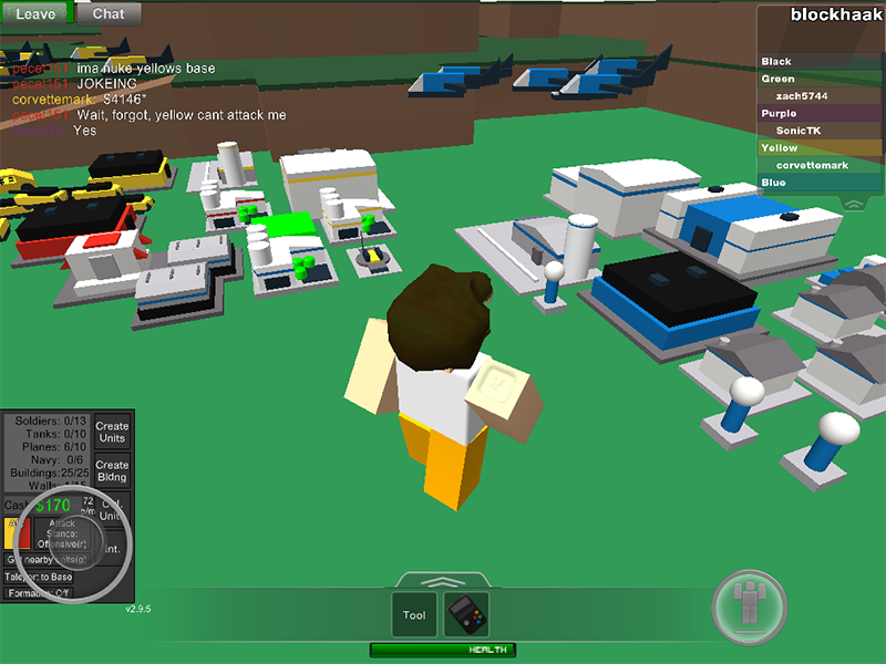
We’ve already optimized ROBLOX’s standard in-game user interface (UI) so it’s more space-efficient and lightweight, but many users build their own menus to accommodate their game’s unique features. For a truly cross-platform game, we recommend you have a similarly light touch and position your UI elements so they don’t impede the gameplay experience. If you can reduce the size of text and buttons, give it a try. Use transparent colors to avoid blocking everything that’s happening behind your menus.
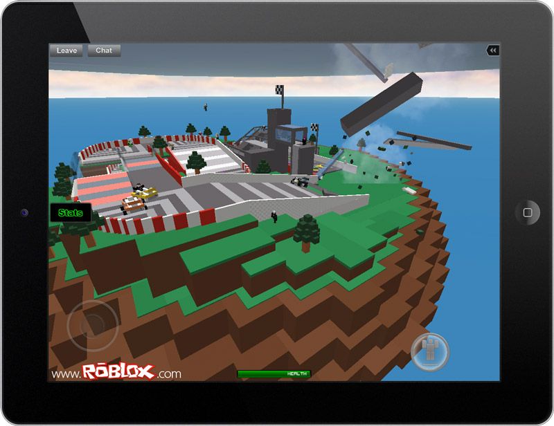
One obvious problem we’ve observed is user-made UIs sometimes reside in the lower-left-hand corner of the screen. These menus work fine on desktop displays, but are unusable on mobile because they end up beneath the virtual joystick, which always takes precedence. In this case, we recommend users move their menus to another part of the screen – perhaps the middle-left side, where they’re still easily accessible with the left thumb.
Content Team Lead Deepak Chandrasekaran (aka Sorcus) wants ROBLOX game developers to know that we will eventually offer more flexibility and, in turn, additional space for user-created UIs. In the future, you’ll be able to toggle everything but the playerlist.
Think simple
Our experimentation and intuition tells us that, as of now, simple games and those that naturally lend themselves to touch controls are resonating with mobile players. Simple doesn’t mean inherently boring or bland; it can mean that very complex features and game play are designed in a way that is intuitive for players. Think about mobile games you’ve played in the past; there’s a good chance some of them wrap complex gaming in simple and intuitive mechanics.
 For example, we’ve seen players constantly hanging out in Block Town – not because it offers any objectives, but because it’s a fun place to gather and socialize with friends. Natural Disaster Survival works well because it only requires adept character movement while the world around you is imploding in a different way each time. Obstacle courses and adventure games, the latter of which we don’t see too often but might see more in the future, also lend themselves to play on mobile devices. Regardless of whether you’re shooting to make it big on desktop or mobile (or both), it’s worth thinking about simplicity as a good thing.
Vehicles are not currently supported by touch controls, but will be soon. Creative Director John Shedletsky believes cunning users could find a way to present mobile users with a sort of UI-based throttle to allow driving.
Detecting touch
If you’re a game developer, you can customize the player experience based on their platform by using the RBX.lua.UserInputService method. According to LuckyMaxer, a ROBLOX user and Wiki writer, UserInputService is a service used to detect the user input available on the device being used. It was primarily created to allow scripts to perform specific to the needs of the device. Here’s the most important line for you scripters:
Game:GetService('
You can attach this “check” to any LocalScript in your game and use it to do a variety of things: give access to section of your game or place, reward players for checking out your game on a mobile device (for instance, by giving them a special hat in game) and even re-assign mouse buttons to tools. For example, if you have a game that relies on right-clicking, you could remap that input to a button or tool on mobile.
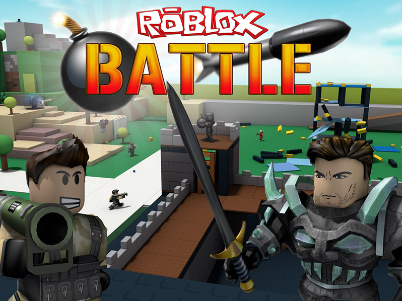
We use this method for our ROBLOX Battle game, which is currently in beta. If you play on an iOS device, you’ll notice there’s an action button next to the jump button. According to Dan Healy, a Software Engineer on the Content Team:
We immediately realized that instead of manipulating a mouse and keyboard, the player would be using their hands, at least partially, to hold the device they’re playing on. With this in mind, we wanted to provide a way for players to use their weapons without having to move their hands all over the screen. By placing a button that fires your weapon within easy reach of your hands, you can comfortably hold the device while aiming and shooting.
The action button allows touch-screen players to fire while panning the camera (and without inadvertently panning the camera), as well. This could be a useful option for other ROBLOX game developers with weapon-heavy games.
Getting started
While we want you to be able to create a game that works across platforms using the tips mentioned above, those of you who already have games might want to consider creating a separate copy as a testing ground for mobile optimization. Dan mentions constant testing as an important part of building out a cross-platform game. While not everyone has every iOS device lying around the house, if you do have access to one you should experience what you’re building from a player’s perspective.
“If you’re spending your time making an awesome GUI, spend a little more and make sure it fits on different size screens,” says Dan. “If you can, it’s always helpful to test your game on different devices. Your players will appreciate it!”
Other things to keep in mind:
- Processing power is lower on mobile devices, so for now we recommend limiting physics objects unless they’re crucial to game play. John Shedletsky cited decorative windmills in Sword Fight on the Heights as something expendable. The game’s physics-based, wobbling platforms, on the other hand, are game play-driven and worth keeping in place.
- iPads can handle about 10,000 parts. iPhones and iPods are limited to about 4,000 parts. If you want true cross compatibility, keep those numbers in mind.
- A single game that feels good across platforms is not easy to design, so keep tweaking and testing.

